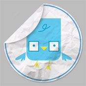
 If you’re anything like me, you’re a big fan of all the free sources out there offering icons, graphics, textures, etc. etc. etc. They come in very handy when you need to add a little extra somethin’ to your designs and don’t have a lot of time to do it manually. But today, friends, I’m going to show you how to do something all by yourself — easily make your own vintage-style wrinkly paper social media icons in Adobe Photoshop!
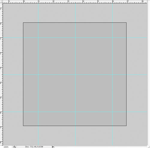
There’s more than one way to skin a cat, as they say, but let’s start out with a clean slate, say 600×600 pixels at 72dpi. Go ahead and drop a neutral background color in there so you’ll be able to see the white circle you’re going to add next. To make it easier on myself, I added some guides to my doc like so:
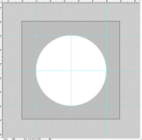
Next, let’s make the circle that will be the base shape of our icon (make it on a new layer). I just used the circle selection tool and dropped white in with the paint bucket, but you could use the ellipse tool, as well.
Before you go any further, make a duplicate of the circle layer and hide it (trust me, it’ll be handy later).
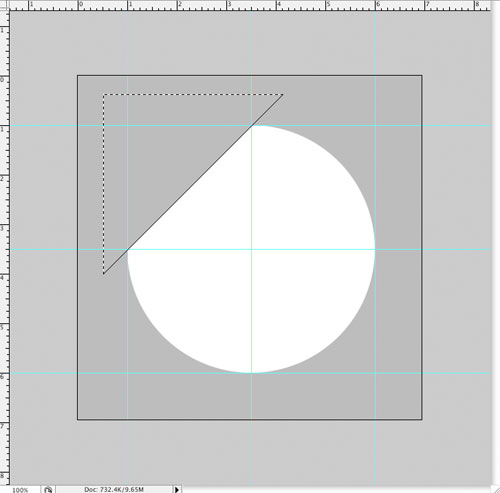
Since we’re going to give the icon a “folded over” look, make a selection using the polygonal lasso tool that will nip a section of the circle at a 45-degree angle (use your shift key with the polygonal lasso tool to get a perfect angle). Using the guides will help you position your selection.
Then, cut the selection off (command+X) & paste it into a new layer (command+V).
Now, rotate the new “flap” layer 180 degrees (edit>transform>rotate 180) and position it so the cut edges match up nicely (those guides come in handy again!). Really zoom in to match the corners up if you need to.
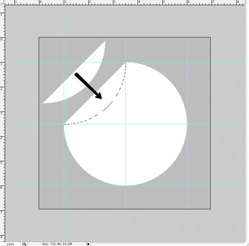
Next, let’s add a little shadow to that flap to give it some depth. Direct select the flap’s shape by holding command and clicking the flap layer in the layers palette, and then add a new layer underneath the flap. Drop some black into the new selection. Doing it this way will give you more control over the shadow than using Photoshop’s drop shadow effect.
Then, bring up the shape transform handles (command+T), and while holding down the command key, drag the bottom-right handle out a bit to shape your shadow.
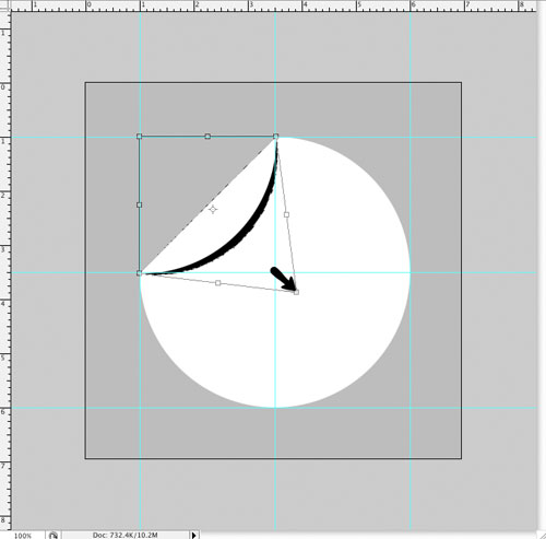
We’ll use a gaussian blur effect (filter>blur>gaussian blur) of 5.0 pixels, set the shadow layer’s blending mode to “multiply,” and drop the opacity down to 25%. Then direct select the main circle shape (command + click on its layer) and add a mask to the shadow layer to keep it within that shape. You should end up with something looking like this:
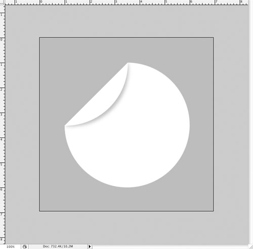
*Masking tip: if you make a selection and then hit the mask button on the layers palette, anything within the selection on that layer is what you’ll see (the rest will be hidden, or “masked off”). If you click the mask button first, you can use a brush to mask off whatever you like.
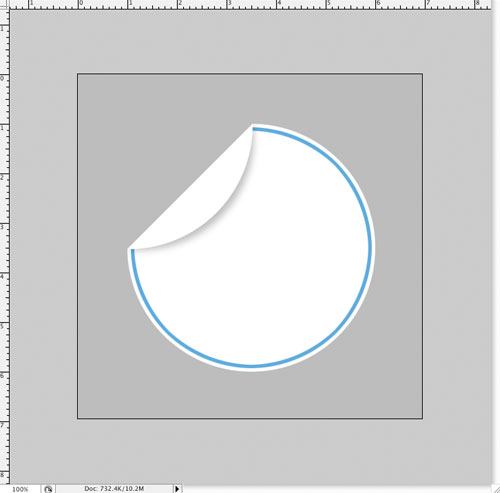
Now that the technical part is overwith, we can dress it up a bit. Let’s add a ring around the edge of the circle for a little visual interest. Remember that circle shape we duplicated & hid a while back? Direct select that layer (so you’ve got a whole circle selection) and then shrink the selection by 5 pixels (select>modify>contract). Now, make a new layer underneath the flap shadow layer and drop in a color of your choice (I picked a nice twitter-ish blue). Then, shrink your selection again by another 5 pixels and delete the color in the selection, leaving yourself a ring. Now, you’ll direct select your cut-off circle layer and add a mask like you did for the flap shadow, leaving you with this:
Now for the wrinkled paper effect. You can use any paper texture you like, but I chose this free one from BittBox. Paste the wrinkled paper image onto a new layer, making sure you keep it underneath the flap shadow layer. Then mask it off using the cut-off circle layer’s selection like you did for the other layers before. If you like, you can unlink the mask from the layer and drag the wrinkled paper around until you get it situated how you want it. Then make the layer’s blend mode “multiply” and drop the opacity down to around 70% (or whatever you prefer).
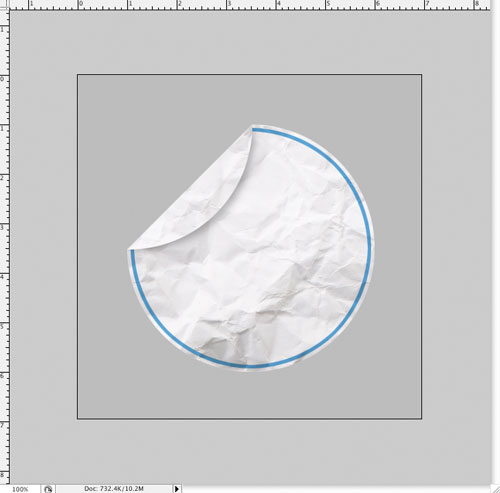
To add wrinkles to the flap, duplicate the paper layer, but arrange the new one above the flap. Mask it off using the same technique as before but using the flap’s shape instead. To make it look more realistic, you’ll probably want to unlink the mask from this layer and drag it around a bit so the wrinkles on the flap don’t match up exactly with the wrinkles on the larger bottom part. At this point, you should have something like this:
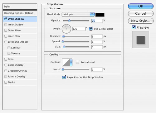
To finish things up, add a drop shadow to the cut-off circle layer (my settings shown)…
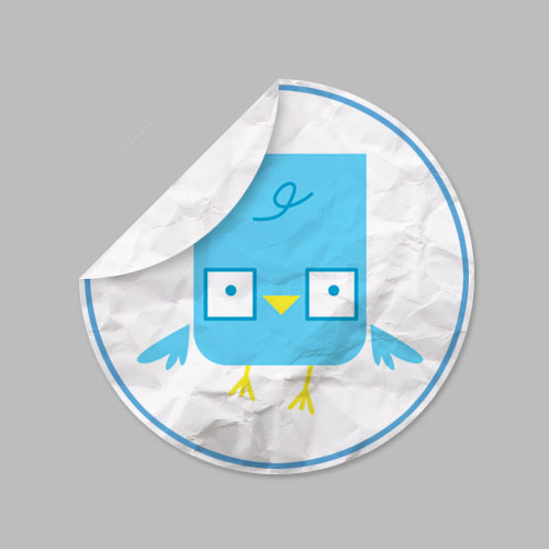
…and then you can swap in elements to use the icons for whatever you like. I’ve dropped in a nice twitter bird from Scott Thigpen for mine. Just be sure you add the new elements under the “ring” layer and mask it off to fit inside the cut-off circle shape. Here’s the finished product!
To better use your new icons on your site, delete any layers you don’t want shown (including the background color layer) and crop any unnecessary area off the edges (be sure not to cut your drop shadow off). Then, merge all your visible layers together (command+shift+E) and resize your image to a more icon-friendly size (128×128 pixels is usually the biggest). Then, use Photoshop’s “Save for Web & Devices” option and use the PNG-24 setting. Voila! Have fun dressing up your site with your snazzy new wrinkly icons!

Cool! Thanks for sharing this Christian.
I usually don’t post in Blogs but your blog forced me to, amazing work.. beautiful …
Way cool! I appreciate you writing this write-up plus the rest of the website is also very good.